_________________________________________________________________________________________________________________________________________
_________________________________________________________________________________________________________________________________________
Showing posts with label gnomon. Show all posts
Showing posts with label gnomon. Show all posts
Gnomon Level Design - Desert Level Screenshots
Screenshots don't paint a full picture when it comes to 3D levels, but I'd like to share some of the key vantage points from my desert level.

Here's the main gate that is blocked off. The player climbs the siege weaponry to reach the top of the wall, where...


And lastly a look at the keep just out of the player's reach. They'll have to find a way over the short wall to reach the key item in there!
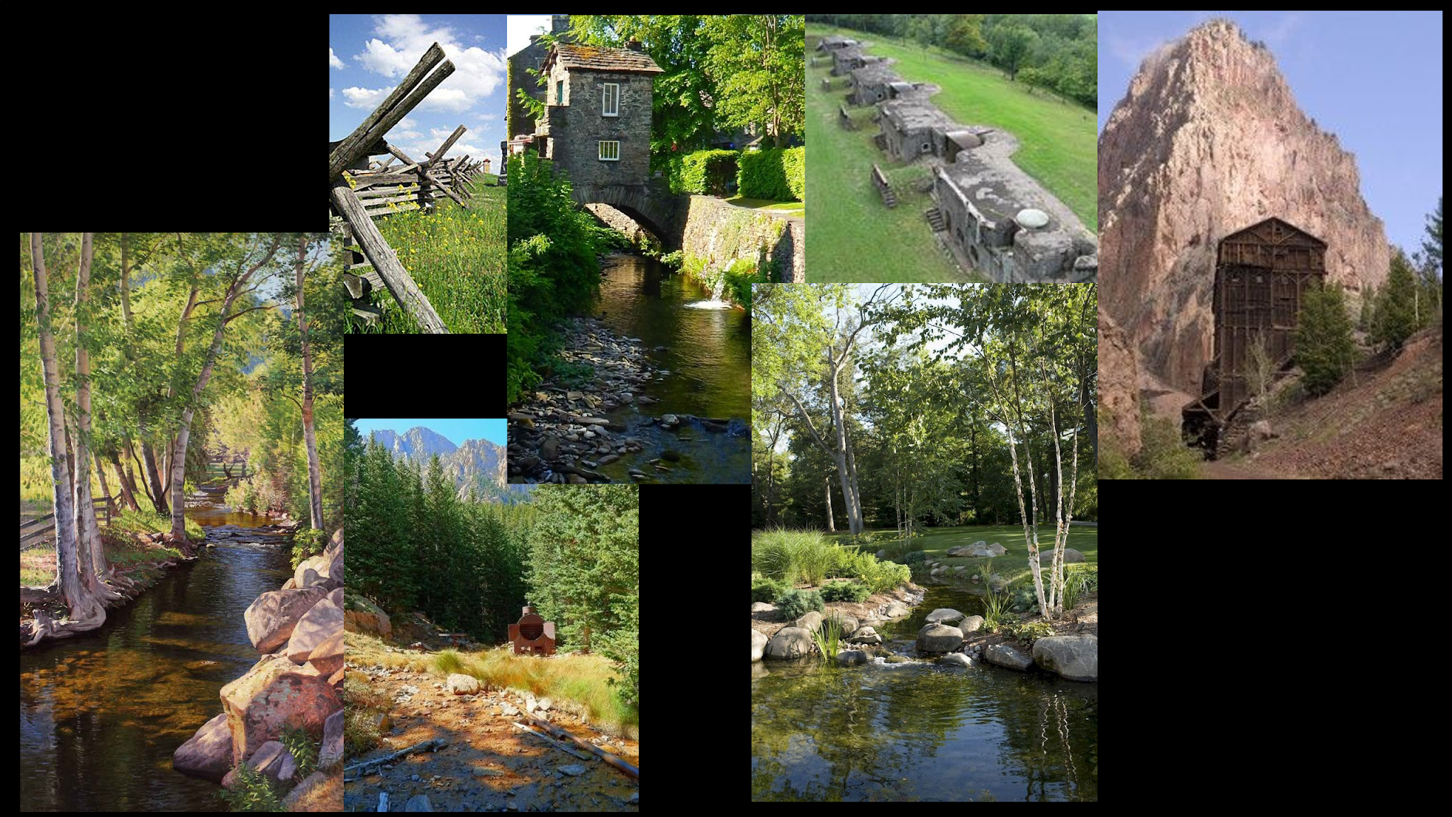
Gnomon Level Design - Desert Project Mood Boards
Final Project for the Level Design course. For this we're learning from the Seattle area in The Last of Us 2. My stage is designed in a Persian fortress feel.


Gnomon Level Design - Control The Contrast
I got great feedback about my level design colors today. Where it's easy to paint in a prototype game level with broad colors, it's also likely that you pick high contrasting colors while building it out. This helps the designer see more clearly the differentiation between object types.
But when controlling the color for the player, the high contrast and high saturation areas should be reserved to attract the player's attention. Less important areas of the game, such as much of the non interactable terrain, is better served with broad strokes of color that meld together and don't call for attention.
I tuned down the saturation across the board (for a second time), and tried to push back the reds in the rocks which were fighting with the greens in the trees.

Gnomon Level Design - Constructing in Unreal


Gnomon Level Design - Trees
Marvel at my popsicle trees. It's fascinating what a bit of shape suggestion and color can do to our imaginations!




Gnomon Level Design - A Core Statement
Last week I started the Level Design course at Gnomon with Zachary Adams. Our first assignment will involve redesigning the Veldin level in Ratchet and Clank. I'm starting with my core statement:
"magical guns on a war torn battlefield"
Subscribe to:
Posts (Atom)